Feather is a pioneer in the circular economy, with a mission to keep furniture out of landfills. Feather does this by offering high-quality rental furniture - that at the end of its rental period can be picked up, refurbished and redeployed. In order to increase revenue, stakeholders decided to offer flexible purchasing options, so customers would have the option to rent or buy their favorite couch.
The site already had a lot of decision making moments for users, such as: Are you in a delivery area? How long do you need your furniture? Do you want to be a member and pay less? My task was to add another choice in the user journey that didn't increase confusion and friction. On this project, I worked with 1 Project Manager, 4 Engineers, and 1 QA Engineer.

I love The Baymard Institute! It is a premier source of ecommerce recommendations and best practices based on 88,000+ hours of research. It is one of my favorite tools for quickly researching ecommerce user behaviors. The Feather journey is more complex than the sites Baymard uses for its case studies, but I still found some good recommendations to keep in mind (shown below). I also did a analysis of our direct and indirect competitors to see how they used the UI on their sites to give users multiple options to rent or buy.
1
Focus the 'Buy' Section on Essential Options.
Too much information or options in the “Buy” section can overwhelm and distract users from adding products to their cart.
2
Hide the Quantity Fields.
Users can be distracted by quantity fields, which also cause interaction issues. Hide the field for products bought in single quantities, but show it for those bought in multiple quantities.
3
How to Display Discounts.
Place discount descriptions in the “Buy” section in close proximity to the product price, and display a single offer once.
3
Put Product Customization in "Buy" Section.
Customization steps can be overlooked and overly complex. Provide a sequential list of customization steps to complete, and use transitions to guide the process.
1
Ecommerce Best Practices
Funnel Improvements
User Research
Competitive Analysis
2
Wireframes
User Testing
User Research
User Journeys
Prototyping
App/Site Architecture
Usability
Accessibility
3
Mockups
UI
Style Guides
Design Systems
I designed three concepts for the Product Description Pages to show users that they could either rent or buy furniture from Feather. Keeping the Baymard recommendations in mind, I created the following concepts:


Concept 1 and Concept 2 asked the user to take too many actions. Concept 1 also hid the variant choice below the viewpoint. Concept 2 had an intimidating amount of steps to take. These steps made sense for a more customized shopping experience, but felt like overkill in this context. I decided to go with Concept 3: The Clean Up. Here’s why...
After I got feedback from my team and we aligned on a concept, I iterated on the various parts of the UI. Keeping my research findings in mind, I made final iterations. Here's what I did to craft the strongest design with a clear price/ variant relationship and the least amount of distraction:


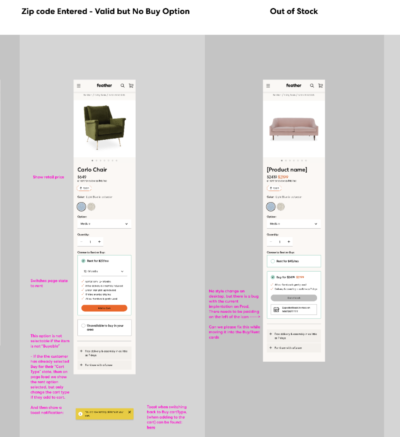
Many of the products offered at Feather have buy or rent exceptions. For example: It’s illegal to rent mattresses, so we can only display the option to buy mattresses to customers. Additionally, some of the furniture vendors that Feather carries allow Feather to rent their products - but not sell them. I mapped out a chart of each exception to share with the engineers so they could have a visual guide on how to handle each use case. This was a wonderful learning moment for me as the Senior Designer showed me how to do this.


Testing! This was an all-hands on deck project with a need for a quick turn around. If we had more time, I would have loved to test my three concepts. Actual user feedback would have helped to get more validation on which concept was the clearest and had the least amount of friction. Additionally, I would do usability testing with the final concept to massage out any kinks in the UI.
Let's talk! I like collaborating with design-mature teams that have a welcoming and human culture. I’m open to working remotely or hybrid in the Bay Area.
Resume

